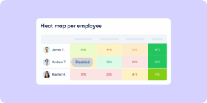
We’re adding a new layer of comparative analysis to the Company results section. Until now, the view showed results for each group separately. With the spider chart, all groups appear in a single visual so you can spot strengths and areas for improvement in seconds, available in both the Evaluations and Surveys tools.
What’s included?
When your evaluation or survey has scoring enabled and 3 or more scored groups, the new feature appears automatically:
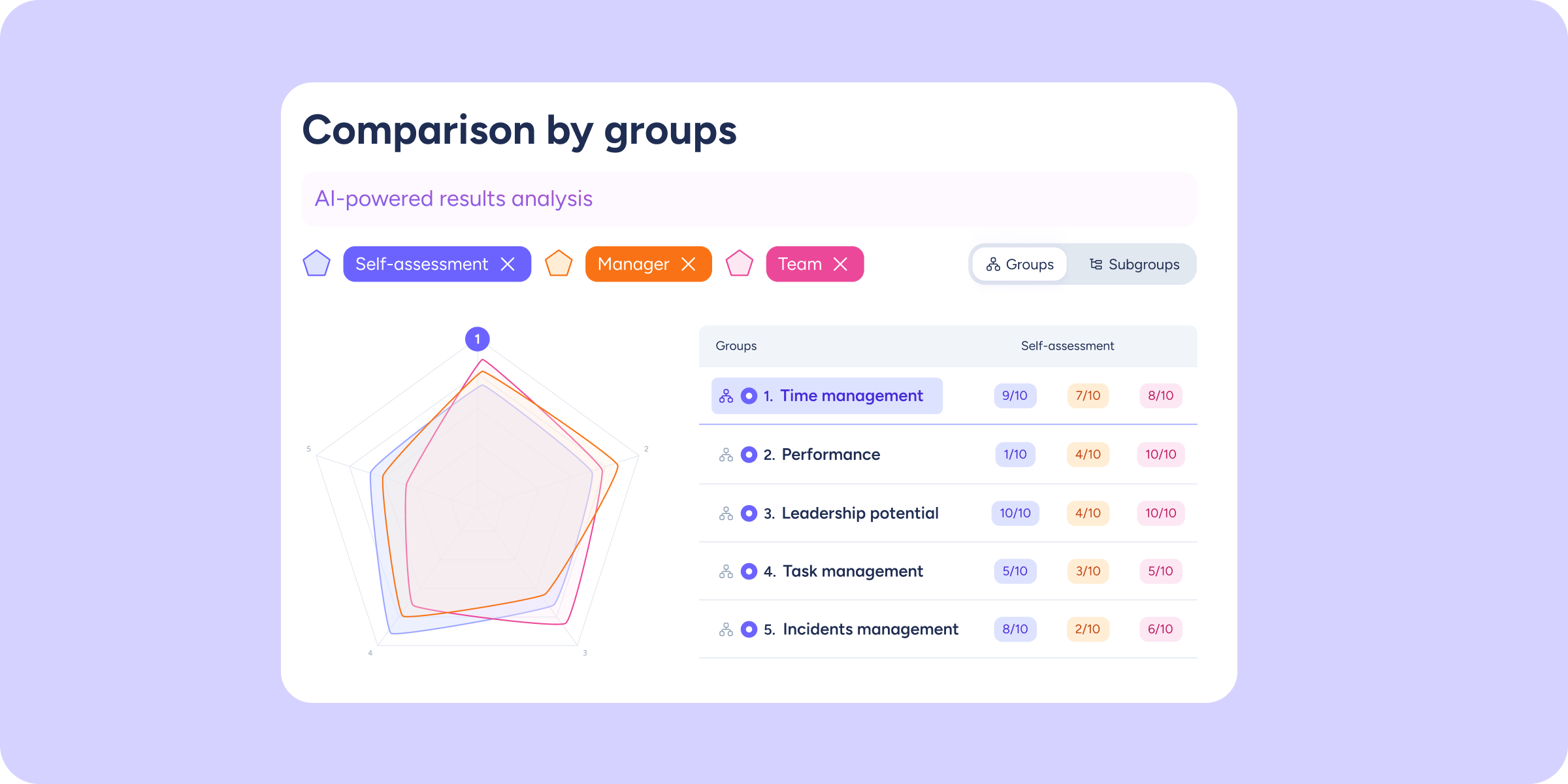
- Spider Chart: each axis represents a question group or subgroup. The shaded area reflects average scores, letting you instantly identify which areas are most developed and which need attention.
- Breakdown by evaluator type (Evaluations only): a polygon appears for each evaluator type involved. Enable or disable them individually to compare how managers, peers, or the evaluated employee themselves rate performance.
- Averages table: alongside the chart, a table displays the average score for each group broken down by evaluator type, so you always have the exact figure at a glance.
- Select up to 10 groups: all scored groups are shown by default (up to 10). If you have more, you can choose which ones to include in the comparison.
- Automatic adaptation: if you select 1 or 2 groups, the spider chart automatically switches to a bar chart for easier comparison.
- Synced filters: page-level filters (workplace, department, group, evaluator type) also apply to the chart, so the data always reflects your exact selection.
We’re continuing to build out the analysis toolkit in the Results view. We hope this new comparative view helps you make talent decisions with greater speed and confidence!