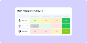
With the launch of previous phases, you could already analyze the big picture and compare performance across teams. Today, we’re completing that experience with the most advanced analysis tool to date: the heat map.
This new feature lets you cross-reference, in a single view, the performance of your departments, workplaces, groups, and employees against each competency or question group in the evaluation.
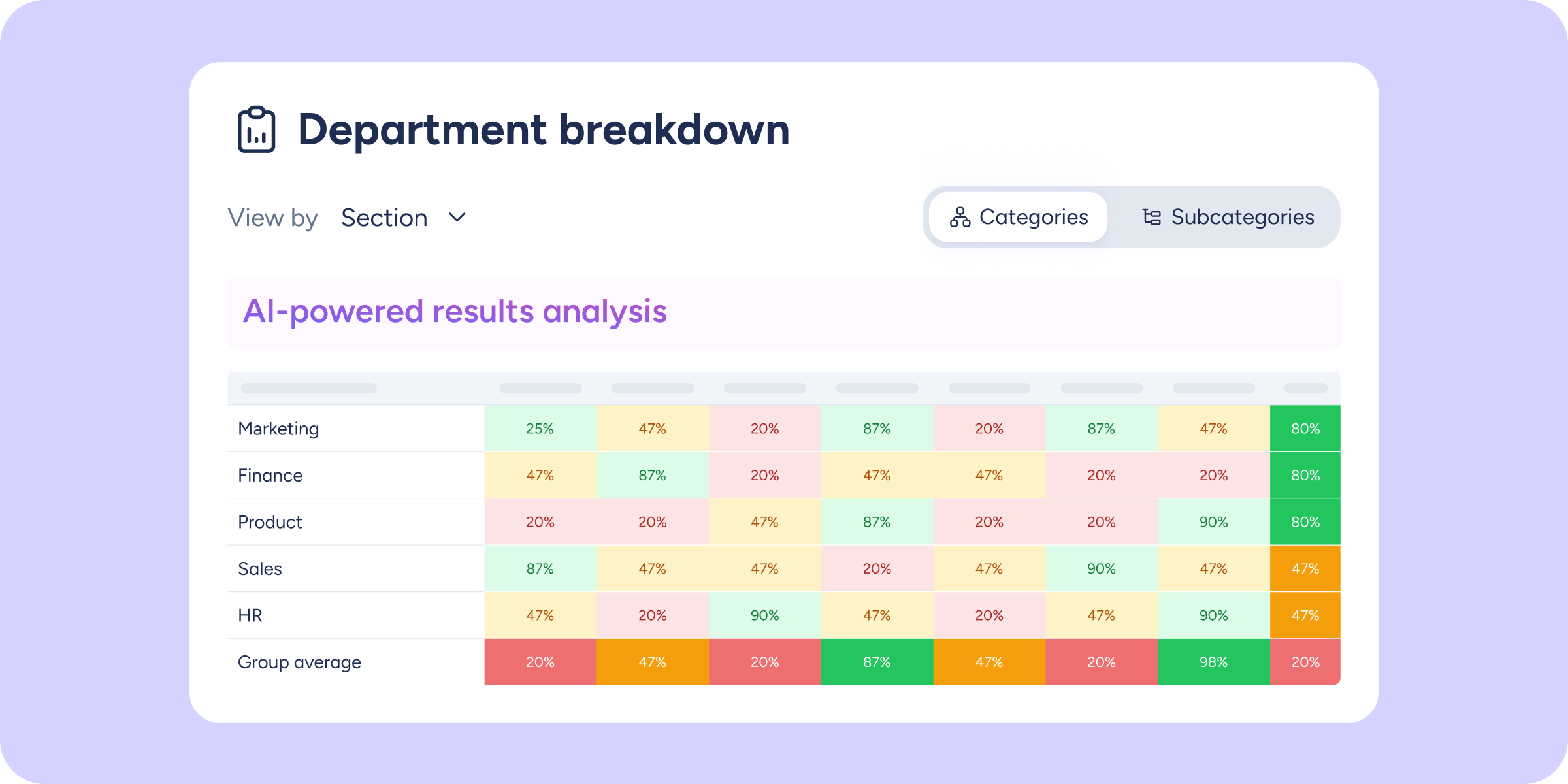
A multidimensional analysis of your organization
The heat map transforms data into a dynamic, interactive table designed to detect specific strengths and weaknesses in seconds:
- Cross-variable analysis: view the average score for each team broken down by question groups or subgroups.
- Smooth navigation: explore large volumes of data without losing focus. Reference rows and columns stay fixed as you scroll horizontally or vertically.
- Custom ranking: the table is sorted by default from highest to lowest overall score.
- Maximum detail: the group and subgroup selector lets you change the depth of your analysis with a single click.
Privacy and accuracy guaranteed
As with all our analysis tools, data integrity is our priority:
- Protection in anonymous surveys: to ensure confidentiality, the system blocks and greys out any cell that does not reach the minimum of 6 responses.
- Full synchronization: the heat map automatically adapts to the global filters active on the page (dates, workplaces, evaluators, etc.).
- Aggregated averages: the table consolidates information by displaying overall averages both by department and by question group in its closing rows and columns.
Go to the Company results section now and discover which areas and competencies are driving your company’s growth with the new heat map.
Want to get the most out of this tool? Visit our Help Center to learn how to navigate the metrics.