We keep improving Recruitment! This week we’ve completely renewed the candidate profile so your selection process is more agile and visual than ever.
What exactly has changed? We’ve reorganized the information into a more practical and optimized layout, without losing any of the features you already know.
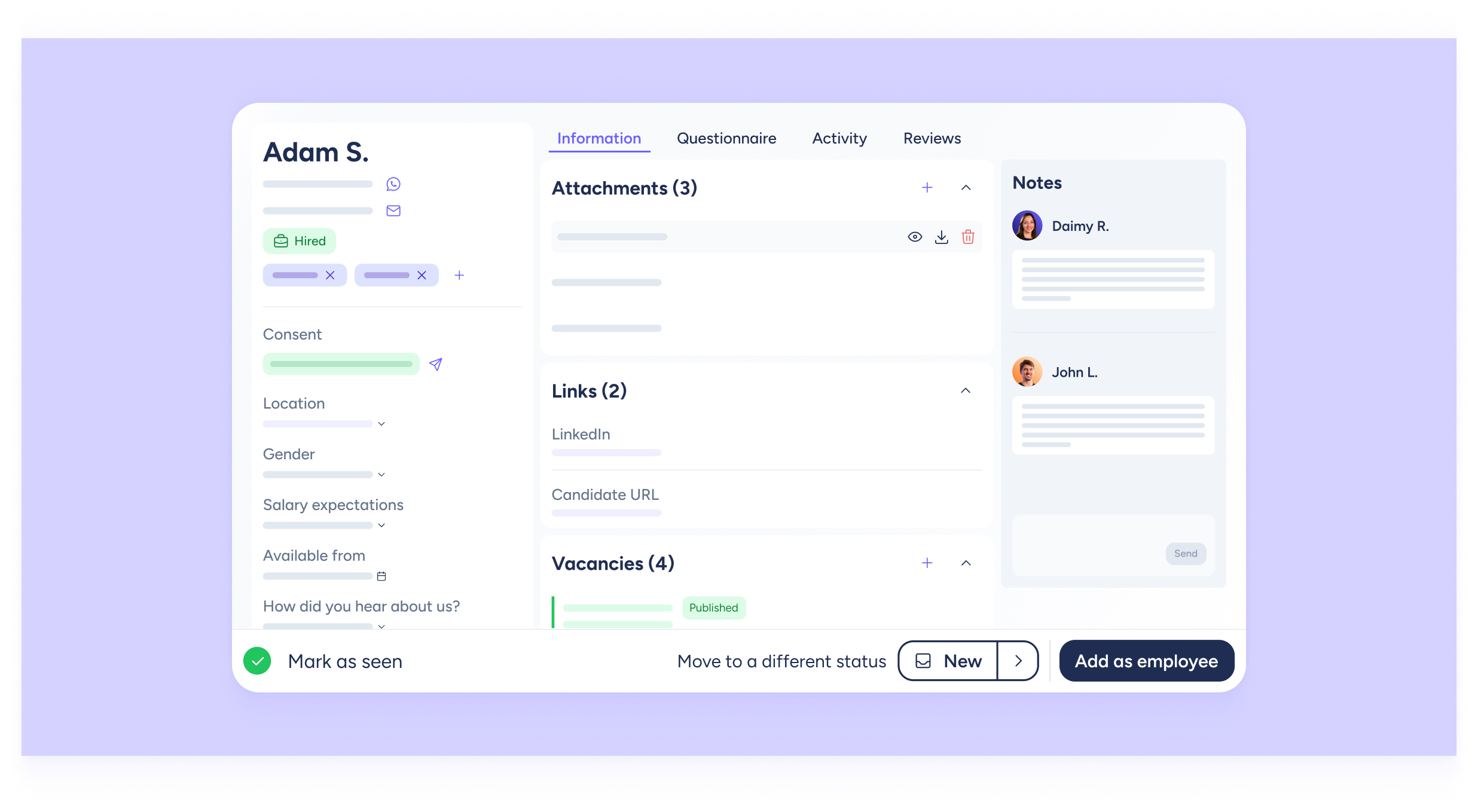
Now the profile is organized into three columns, making the information clearer and easier to access at a glance
On the left 🧑💼 Basic information
Name, phone number, and email address, along with key details such as location, salary expectations, and availability. Finally, a space to read the candidate’s personal introduction.
In the center 🗂️ Interactive tabs
Four sections that let you manage the entire recruitment process:
- Information: review their CV, LinkedIn or personal website links, and the history of vacancies they’ve applied to.
- Questionnaires: check the answers the candidate provided in the application forms.
- Activity: follow the candidate’s progress throughout the process, stages completed and recruiter actions (profile reviewed, marked as viewed, etc.).
- Reviews: see the ratings (up to 5 ⭐) given by your recruitment team.
On the right 📓 Your notes
Notes remain visible at all times so you never miss an important detail. Leave useful comments that can help you later or support other recruiters on your team.
We’ve also kept the actions you love, but now grouped to make your workflow smoother:
- Top left – Viewing actions: navigate between candidates in the same stage, see all applicants for a vacancy, use the search bar, or even sort applicants alphabetically.
- Bottom right – Candidate actions: mark a profile as viewed, change a candidate’s stage, or add them as an employee.
This redesign is more than just a visual update. It’s a renewed experience: more intuitive, more practical, and more optimized. Now, everything you need for recruitment is right where you need it, in a simpler format.